Appearance
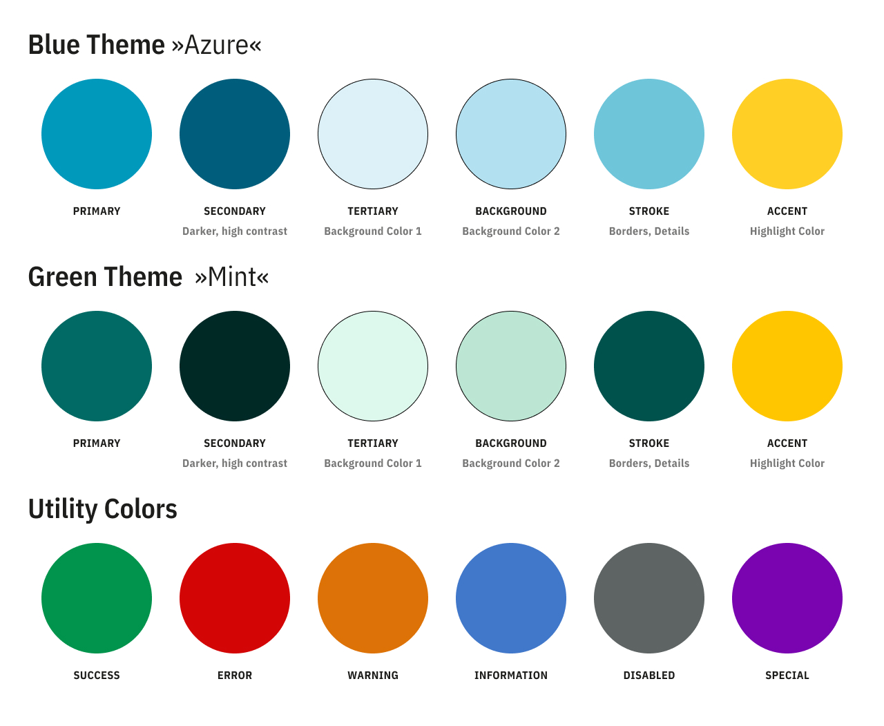
Theme Color Documentation
This document describes the two color themes shown in the supplied palette screenshot.
Token Naming
The following semantic tokens appear in the screenshot:
PRIMARYSECONDARYTERTIARYSTROKEACCENTBACKGROUNDSUCCESSERRORWARNINGDISABLEDSPECIALINFO
Theme 1 (Blue - Azure)
Theme 1 uses a bright teal-blue base with supporting yellow, green, red, orange, gray, purple, and blue accents.
| Token | Color (Hex) | Preview | Suggested Usage |
|---|---|---|---|
PRIMARY | #0099BC | Main brand color, primary actions, major highlights | |
SECONDARY | #005E7C | Supporting brand surfaces and secondary actions | |
TERTIARY | #DCF1F8 | Soft tinted backgrounds and low-emphasis containers | |
STROKE | #6EC5DA | Borders, dividers, chart strokes | |
ACCENT | #FFCF26 | Attention-grabbing accents and callouts | |
BACKGROUND | #B3E0F0 | App/page background tint or large soft surfaces |
Theme 2 (Green - Mint)
Theme 2 shifts the palette toward deeper green tones while retaining the same semantic structure for most tokens.
| Token | Color (Hex) | Preview | Suggested Usage |
|---|---|---|---|
PRIMARY | #016A64 | Main brand color, primary actions, major highlights | |
SECONDARY | #002926 | Supporting brand surfaces and strong contrast blocks | |
TERTIARY | #DDF8ED | Soft tinted backgrounds and low-emphasis containers | |
STROKE | #00524D | Borders, dividers, chart strokes | |
ACCENT | #FFC600 | Attention-grabbing accents and callouts | |
BACKGROUND | #BCE6D4 | App/page background tint or large soft surfaces |
Utility Colors
Utility colors are used in and are the same for both themes.
| Token | Color (Hex) | Preview | Suggested Usage |
|---|---|---|---|
SUCCESS | #00944C | Success states, confirmations, positive indicators | |
ERROR | #D30606 | Error states, destructive actions, alerts | |
WARNING | #F39800 | Warnings, caution labels, non-blocking alerts | |
INFO | #4178CA | Informational messaging and neutral status indicators | |
DISABLED | #1D1D1B | Disabled controls and unavailable content | |
SPECIAL | #7904B0 | Special-purpose highlights or premium/system-specific accents |
Usage Guidance
Primary Semantic Roles
- Use
PRIMARYfor the most important interactive and branded elements. - Use
SECONDARYfor supporting emphasis wherePRIMARYwould be too strong or too frequent. - Use
TERTIARYandBACKGROUNDfor low-contrast surfaces and sections. - Use
STROKEfor separators, outlines, and low-weight visual structure.
Feedback States
- Use
SUCCESS,ERROR,WARNINGandINFOonly for semantic feedback. - Prefer
_15variants for large background fills behind text. - Prefer
_50variants for badges, pills, and medium-emphasis state containers. - Reserve the full-strength base token for icons, text, borders, or critical highlights.
Neutral and Special Roles
- Use
DISABLEDtokens only to communicate unavailable or inactive states. - Use
SPECIALsparingly for unique product features, premium states, or exceptional highlights.